Google has quietly updated its ‘G’ logo for the first time since 2015, introducing a smoother colour-blended design that reflects its modern branding and AI product aesthetic.
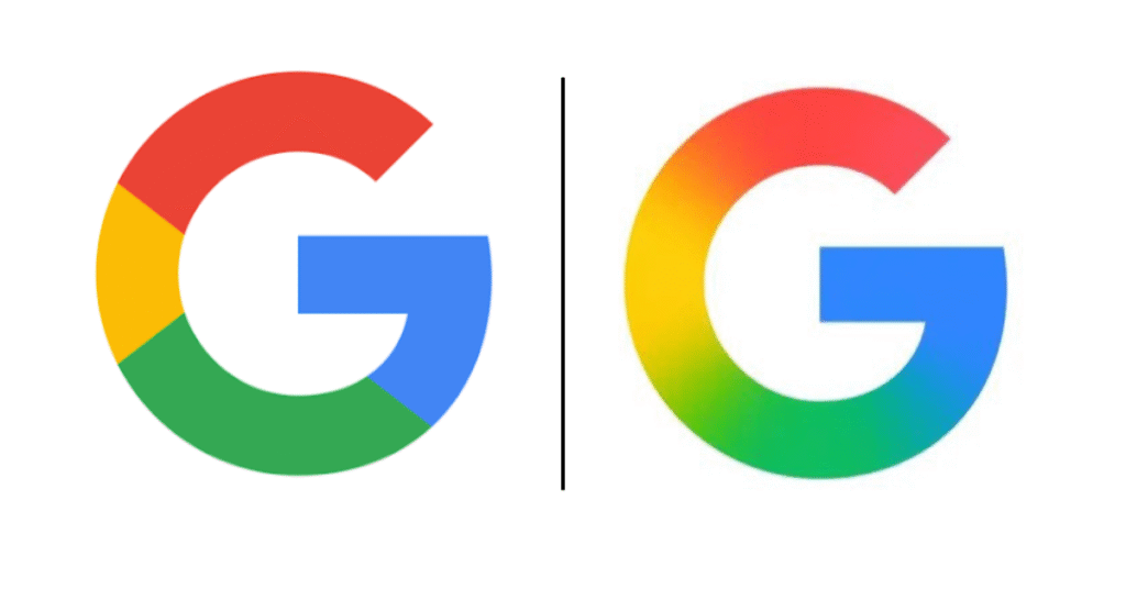
Google has rolled out a refreshed version of its iconic multi-coloured ‘G’ logo, marking the first update to the symbol since its introduction in 2015. The redesigned logo is now gradually appearing in Google’s apps on both Android and iOS platforms.
First introduced as part of a broader rebranding effort on September 1, 2015, the current circular ‘G’ replaced the older white lowercase ‘g’ on a blue background. That 2015 change also brought the modern Product Sans typeface to Google’s main six-letter logo.
What’s Different This Time?
According to a report by 9to5Google, the updated ‘G’ design drops the sharp boundaries between its classic colour segments. Instead, Google has applied a gradient-like blending effect: red fades into yellow, yellow into green, and green into blue—offering a smoother, more unified look.
This new visual treatment is already live on the Google Search app for iOS. As of May 12, it also appeared in version 16.18 (beta) of the Google Search app on Android. However, the rollout seems to be happening in phases, as many users—such as those checked by the Gadgets Now team—have yet to receive the updated icon.
More Than Just a Cosmetic Change
While the design changes are subtle, they align with Google’s recent efforts to unify its visual branding—especially across AI-related products like Gemini and AI Mode in Search. The gradient design fits with the aesthetic seen in those services and may signal a broader shift in Google’s visual direction.
So far, Google hasn’t confirmed whether it plans to update its full six-letter logo or apply similar changes to icons for other services like Chrome, Maps, or Gmail. However, given Google’s consistent use of the four-colour scheme across its product family, such updates wouldn’t come as a surprise.
Looking Ahead
The redesign lands just ahead of the upcoming Google I/O event, where the company is expected to introduce Material Design 3 with Android 16. Speculation suggests a formal announcement regarding the logo update may be made during the event.
This marks Google’s first significant logo revision since 2015 and comes nearly 10 years after the last update—mirroring the 10th-anniversary redesign of the Google Play logo. While the changes may be subtle to the casual eye, they reflect the company’s evolving design language and its push for consistency across an expanding ecosystem.
Also Read: Indian Govt Issues ‘High Risk’ Warning for Apple iPhone, iPad Users: All details inside
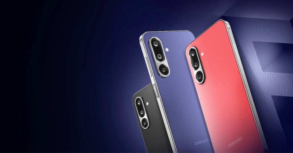
Also Read: Samsung Galaxy S25 Edge Launching on May 13: Expected Features, Price, and More
Also Read: iQOO Neo 10 Set to Launch in India on May 26: Key Features, Specs & What to Expect